
Inkling: Inline Formatting Tools
Summary
Simplify formatting and styling content for authors at digital publishers with a single, discoverable, convenient place to style their content.
Role + Team
Lead Designer (with 1 PM, 1 User Researcher, 4 Engineers)
Dates
October 2015 – Jan 2016

Background
From our regular general usability studies, feedback collected by our Customer Support team, and our own use of Inkling for authoring, we found 5 big issues with formatting:
- Formatting options exist in 3 places (the contextual toolbar at the top, next to some elements, and in the breadcrumb bar in the bottom left) – the complexity leads users to look for options in the wrong places
- Some buttons in the contextual toolbar are always hidden in an overflow menu and users don't find them
- There's a large mouse travel distance when applying formatting to items at the bottom of the page
- The breadcrumb bar (highlighted area in the bottom left) is hard to find
- And it uses the CSS class model to add formatting like colour and font (i.e. you can add .red and .blue and the latter overwrites the former), which confuses users unfamiliar with HTML/CSS
Providing a simple authoring experience for non-HTML users to make beautiful content is a key part of Inkling's value proposition, so solving these issues was a high priority.

Research and Brainstorming
When our R&D team decided to focus on improving the authoring experience in September 2015, our research team surfaced issues users had with formatting. I worked with our research team to compile existing research to see if the user needs matched up with switching to an inline formatting bar, as our design team had thrown around the idea for a while, inspired by the simplicity of Medium's authoring experience.

We found that we already had user feedback about difficulty finding the breadcrumb bar and users not finding buttons in the overflow section of the contextual menu bar. I made some quick sketches of how the formatting bar could work, suggested it could make all the options more visible while reducing the mouse travel distance. A possible downside was whether showing a formatting bar every time a user clicked into an element would distract from the authoring experience.
I believed it wouldn't, and got buy in to do research on this with engineering's help to build an interactive prototype, as it would be hard to convey the experience to users with an InVision prototype.
With the coded prototype, we ran user testing sessions and confirmed that users quickly found the formatting options, felt it was more logical having them right by the element they were formatting, and weren't distracted by the toolbar when editing if it disappeared when they started typing.
Iteration and Details
During user testing, we found some unexpected pain points that led me to make more design changes.
For example, users frequently asked about how to switch colours. The only way to do that at the time was to use the breadcrumb bar to apply CSS classes for colours, but this confused users for two reasons:
- The class picker was multi-select (because multiple CSS classes could be applied), so multiple colours could be applied, which overwrote each other.
- The colour classes changed text colour on some elements, but background colours and line colours in others.
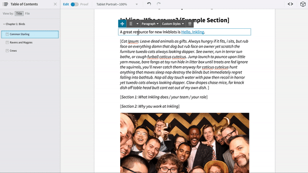
In response to this, I added single-select colour pickers for background colour and text colour to the inline formatting bar, and worked with our Creative Services team to make sure these changes were applied to the new templates users built their projects from.

We also found that our existing move handles confused users – half of them didn't realise they were move handles, and had been moving content by cutting and pasting. They also were confused by the element name shown on the selected element. We previously used the HTML tag name and classes, but discovered since most of the authors are non-technical, they often didn't know what the tag names or classes meant. I defined a set of non-technical labels for our new drag handles.

Final Designs
For the toolbar's visual design, I chose a dark theme for greater contrast with the (mostly) light content and used rounded edges to match Habitat's existing friendly UI. I also used icons for almost all of the buttons to make the bar scalable to accommodate custom buttons some of our users added, with labels for every button (and shortcut info where appropriate) in the dropdown to make sure the functions were all clear.
The feature was released to all users in our January 2016 update, and was the first significant update to our rich-text editor in 2 years. The feedback from the internal alpha and the previews with customers was overwhelmingly positive. I'll keep you up to date on feedback from our general release.
Because we wanted to get the improvements into users' hands as quickly as possible so they could benefit from easier editing and get feedback to us sooner, we decided to save some changes for V2, like separate dropdowns for picking colours, and exposing a way for technical users to add their own custom buttons to the toolbar.
